

Why the Russian MoD map is wrong
And why it’s probably not as wrong as you thought

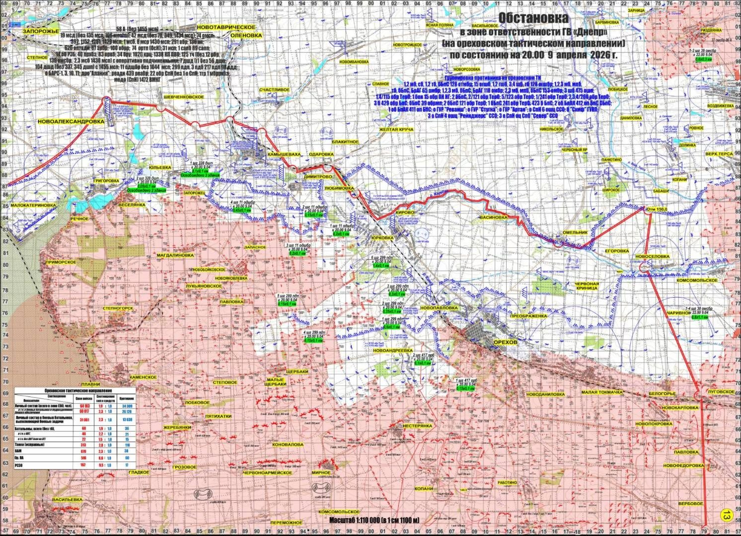
This week, a map was shared online by M0nstas purporting to be a leaked internal Russian MoD map of the frontline in Ukraine, along the Zaporizhzhia axis.
The map, dated April 9th 2026, quickly drew criticism from map makers and conflict trackers across the board, from pro-Ukrainian to even some pro-Russians, for how extreme the extent of Russian control was shown to be.
And that was easy to do. If you compare the frontline with almost any mapper that claims to be at least partly neutral, you can see some stark differences in where the frontline is shown to be.
Almost all map makers for the war in Ukraine will base their information on geolocations, bringing in non-visual information from frontline units’ public posts, or direct contact with people along the line.
Inevitably, working with almost exclusively open source information will mean that the maps online lag, to some extent, behind the true movements of the frontline. Even those who make use of information from people on the front who can pass messages on in near real time, the most important information will likely be held back for operational security and the general safety of units involved.
That being said, the map being circulated is from 7 weeks ago, which is more than enough time for even the slower methods of confirmation to catch up.
So what is going on with the map?
Bending the truth
One option, of course, is that the map has been made to appease higher-ups in the Russian command structure. As those who follow the conflict even from a distance will know, advances are now generally quite slow-paced and focused on just a handful of sectors of the frontline.
Regardless of the side which you support in the conflict, the casualty rates are significant and can be difficult to justify without tangible advances being made. Even in a “war of attrition“, making very little progress territorially, particularly 4 years into the conflict, is not a good sign.
It would then make sense that if you are a commander in the Russian army, you might report the situation in your area as being better than it is. Better performing units will often be prioritised for reinforcements, resupply, and new equipment. In that sense, there is a motivation to over-report successes.
Ukrainian drone units have been known to be prioritised for providing evidence of successful hits.
On the other hand, without actually making progress, this strategy doesn’t work for long and can come back to bite you in the long term. That’s particularly true if your progress is broadcast by those higher up in the command chain.
On the opposite end of the frontline is Kup'yans'k, which Russia had claimed to be in full control of in mid-November last year. Most mappers, though, marked large parts of the city as never being any more than contested, with some parts of the south and west never leaving full Ukrainian control.
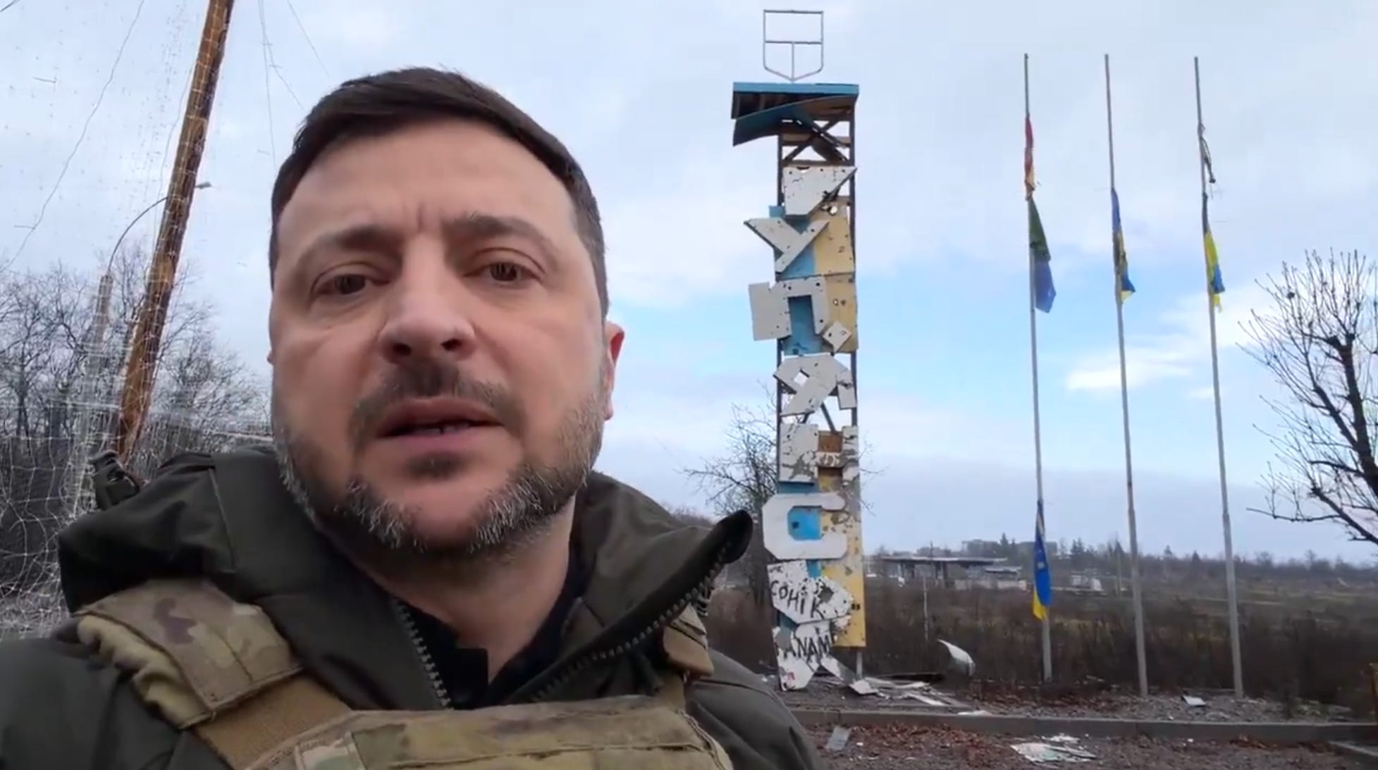
We know for certain that the city was not fully captured, as Ukrainian President Zelenskyy visited the entrance to the city just 2 weeks after the announced capture. While he has been very close to the frontline before, the extent of drone warfare would have prevented a visit this close had the whole city been under Russian control.
What is thought to have happened is that advances here were internally exaggerated, contested areas were reported as secured, and the initial Ukrainian positions were reported as being the contested spaces.
The fight for the city was far from over, and just over 6 months later, many mappers now show the city to be primarily or completely under Ukrainian control again. The propaganda victory at the time was valuable, but now, while the loss can be somewhat talked around, it can’t be fully ignored.
The city is a key target along the line, and to take it properly in the future, significant resources will need to be prioritised there. Making the argument back up the chain for those resources will be a lot more difficult now if they still think or had thought that the city was effectively already taken.
Defining the frontline
Another option is that the definitions used by the Russian MoD are very different to how the map is being read by external observers. While deciding how to mark the frontline has been a challenge since the very start of the war, it has become increasingly difficult as the grey zone expands further and further.
The full-scale invasion
At the very start of the full-scale invasion, there were two types of frontlines.
The first was the old frontline from the ongoing 2014 conflict. This line had been almost static for years and was covered in complex fortified positions with hundreds of miles of trenches along it.
This part of the line was fairly straightforward to map, a solid frontline with the odd breakthrough to track. Most positions were clearly identifiable and unmoving.
The other was the border positions. Simple border checkpoints, in some areas with limited fortifications, while in others, little more than a gate and a guard house.
The advances along these axes were more complex to mark. Russian vehicles were driving down roads deep into the country, not stopping to secure positions, as it was thought there was little reason to do so.
On the Crimea to Kherson advance, there is even footage of Russian vehicles and Ukrainian vehicles driving down the same roadways. There was no frontline to speak of initially. The only thing to mark was the routes of advances and the concentration of forces when they stopped pushing.
Below is one of the best displays of this contrast. Mappe Nathan Ruser clearly distinguishes here between the two areas of Russian firm control, in the Donbas and Crimea, and the axes of advance out of these areas and across the Russian and Belarusian borders.
