

How to spot AI maps
Some tips on the indications that a map has been generated by AI.

Recently, I’ve been spotting more and more maps coming up on my feeds that have been generated by AI. It may be because of my algorithms, but apart from a handful of exceptions, almost all of the AI maps I have seen posted are of West Africa. The exact reason behind that I don’t know for sure, but I would think that it is because it is a part of the world with fewer ‘legitimate’ maps being made, and people are less familiar with the region, and so less likely to spot the errors.
Some of these are quite obvious to spot, but others, at least at first glance, look quite good. For all of them, though, once you really start to concentrate on the details, the flaws stack up, and the fact that it’s been generated by AI becomes clear.
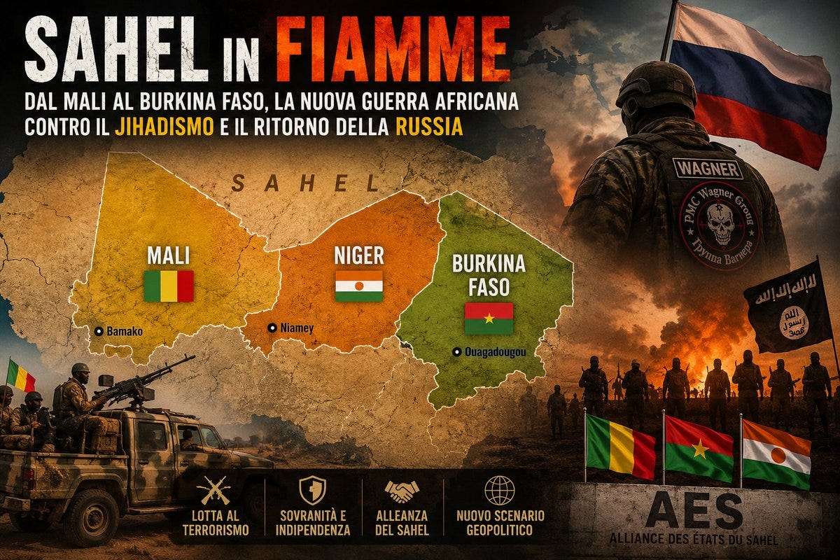
Here’s one that is very wrong and hopefully easy to spot. Niger is pretty accurate, but Mali is the wrong shape, and Chad has been labelled and coloured as Burkina Faso, which should be under Mali, bordering western Niger.
The map below is one that came up several times for me over the past week from multiple different accounts. Due to the scale of the map and the largely familiar shapes of some of the countries, even someone familiar with the Sahel insurgencies could be forgiven for not taking a closer look and instead just accepting its validity.
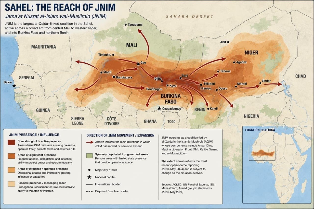
Take a look at it yourself. Would you assume this was AI?
The map itself has clear professional styling. An indicator just a few months ago would have been vaguely correct, but still an inaccurate spelling of place names. But spelling in the title, description, legend, and the map itself is all good. The map even cites some solid, reliable sources such as ACLED.
Take a closer look at the map and compare it with a Google Maps screenshot of the same area, and some issues start to become obvious.
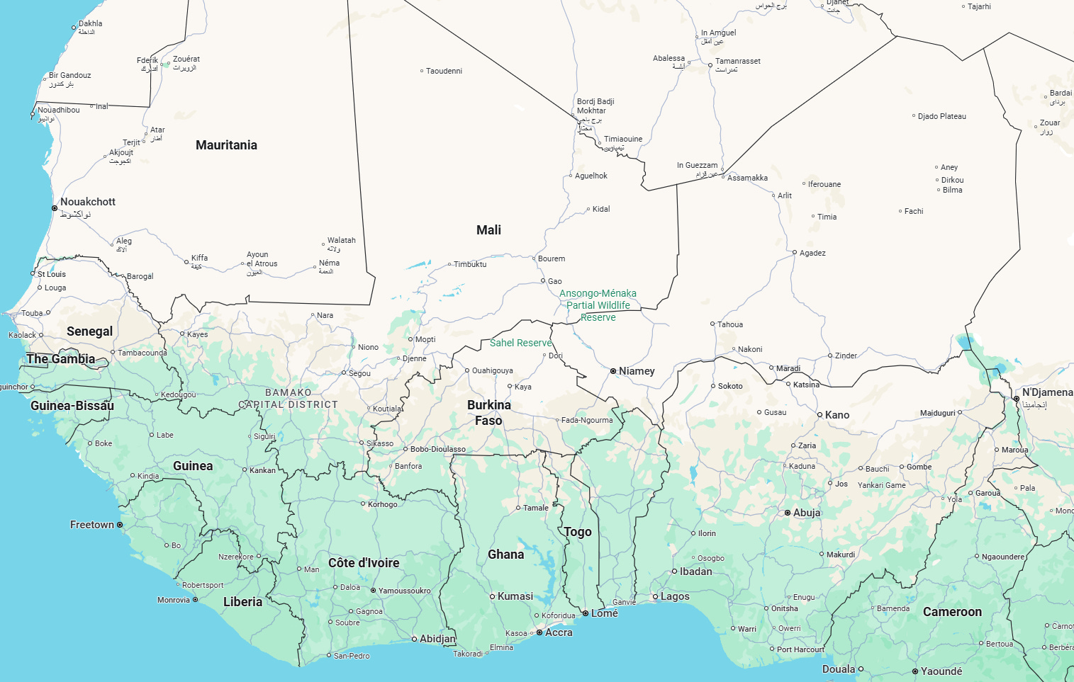
Some of the issues include:
Extra countries. See between Togo and Benin, Mali and Burkina Faso, and Mali and Niger.
Countries aren’t the right shape. What is labelled as Benin takes up a large part of northwestern Nigeria, and Guinea is cut in half.
Cities aren’t quite right. Some are hard to clearly critique as the borders you would use as a reference point are off themselves, but Ouagadougou (incidentally, my favourite capital city name) in Burkina Faso, and Dakar in Senegal are in the wrong places.
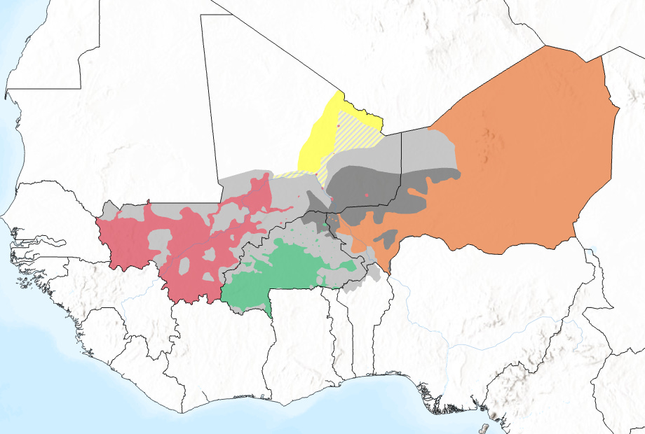
The presented data is wrong. Aside from the base map inaccuracies, despite referencing good quality sources, the area marked as being ‘JNIM presence/reach’ isn’t right. The marking goes much too far east in Niger and not far enough west in Mali. Compare the marking to the map of the area made last month by Thomas van Linge and me. JNIM operating areas are shown in pale Grey.
Bonus countries
In the same way that a language model may hallucinate events or other details, maps generated by AI currently have hallucinated countries. In the example above, there were multiple extra countries added in. The origin for them is fairly straightforward. Some of them are just an additional false line added inside an otherwise real country. Others are repeats of largely accurate borders, such as the one between Mali and Niger, or the second Burkina Faso.
Here is another example of a map that looks reasonable at first glance, but has an additional country.
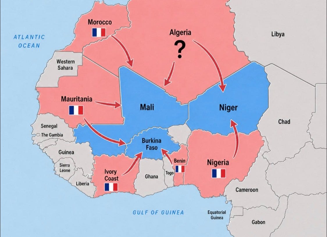
There are inaccuracies with most of the borders, but you could argue that it is a stylistic choice and doesn’t take away from the message being conveyed by the map. The key issue is western Niger, on the border with Burkina Faso; in this map, it’s been cut off into its own country. Gabon, in the bottom right, has also apparently annexed the Republic of the Congo.
Inaccurate borders and places
This one can be much more difficult to spot if you aren’t familiar with the country or region being displayed. Sometimes the boundary of the focus country and the labels of locations within it will be more or less accurate, but the closer to the edge of the display, the more inaccuracies crop up. An example of that in the map above is Libya, where the northern coast should be visible, but has not been rendered at all.
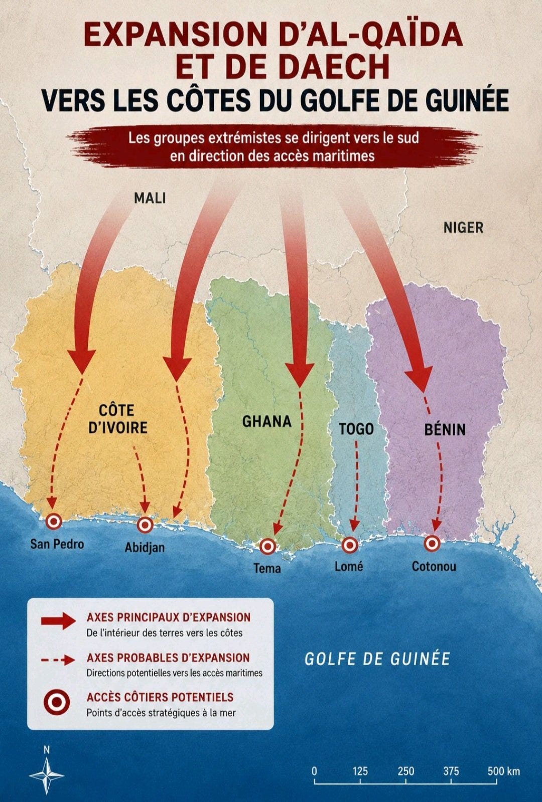
The map below shows the countries along the Gulf of Guinea. Again its vaguely familiar, particularly the slimness of Togo squished between Ghana and Benin. But the borders of all four countries are off and the wrong shapes and overall sizes, as with the first map, Benin eats into a large part of Nigeria.
Style clues
All AI-generated content has styling preferences that carry across to almost all of its outputs. This is because of the way generative AI works, trying to predict what should appear based on its training data. For language models, if a certain phrase has appeared enough in its training set, then it will favour using it.
Lots of you will likely be able to identify a handful of tells that a piece of text has been written by AI. Wikipedia has quite a good “Signs of AI writing” article on some of these tells.
Although they can tell of something being written by AI, or in our case, a map created by AI, the fact that AI uses these stylistic choices is because they are actually used legitimately. So obviously, if a piece of text uses the em dash (—) or the common “Not just X, but also Y” structure, it could very well be written by a human, but it is one clue to note when trying to identify whether something has been made by AI.
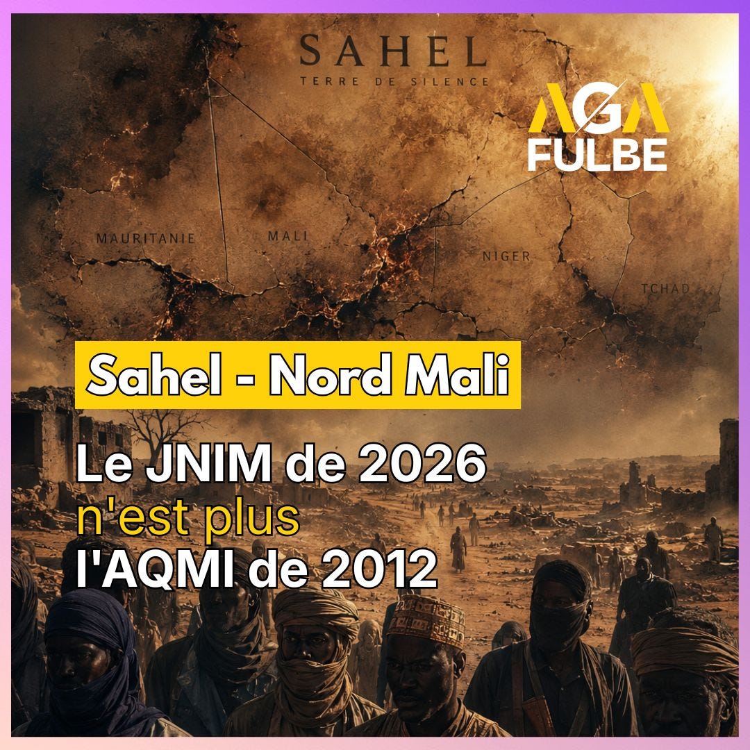
When it comes to maps, AI also has a couple of repeated stylistic choices. One that I’ve noticed quite a lot is a dabbed paintbrush effect visible particularly clearly in the visualisation above, but you can also spot it in the Gulf of Guinea map further up (more clear in the sea), and in the first map as well.
Ghosting
Another thing that I’ve noticed for the AI maps that have come across my feed is faded markings. Sometimes it’s for a bit of text, or something that has been coloured in, others it’s a sort of ghosted line where the AI is trying to guess where a marking should be, but seemingly not committing to or completing the marking.
The map below shows a few examples of that. Some of the arrows are faded, the three dashed blue lines, but also the red line in the bottom right. The borders are the biggest tell for this one, though, for fading. At several points along the border, the line fades out, and where the top blue dashed line crosses the border, the border juts sideways into the arrow instead of following the actual path.
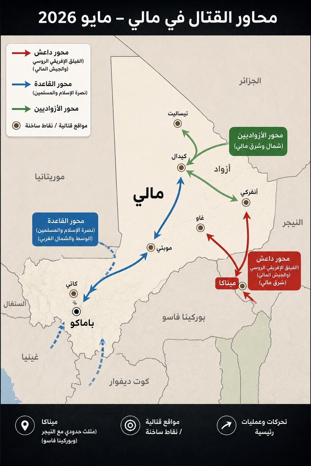
Beyond that, we see some of the earlier errors mentioned as well. The cities are vaguely in the correct locations relative to one another, but other than the capital Bamako ( باماكو ), the rest aren’t in the right locations.
Here is another example of an AI-made map. You should be able to spot quite a few of the issues covered above. The paint blotching, colour blocks and issues with sharpness of edges, both in the text and in other markings and borders.
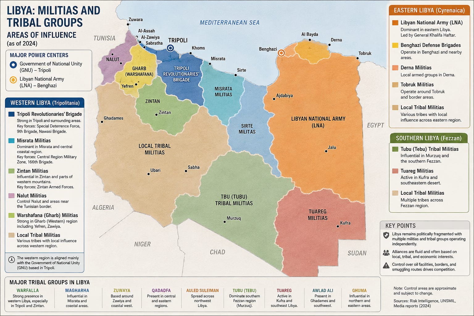
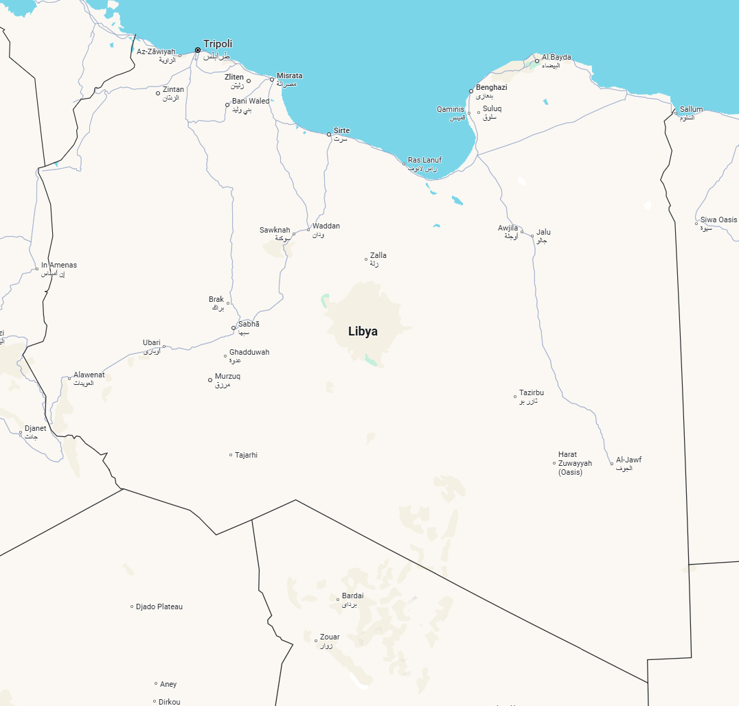
There are also the borders, largely pretty accurate but with a couple of errors inspired by the real borders. Check the Libya/Sudan border in the bottom right of the map with the actual border from Google Maps below. The distinctive right-angle border is there, but the AI has hallucinated it in a second time.
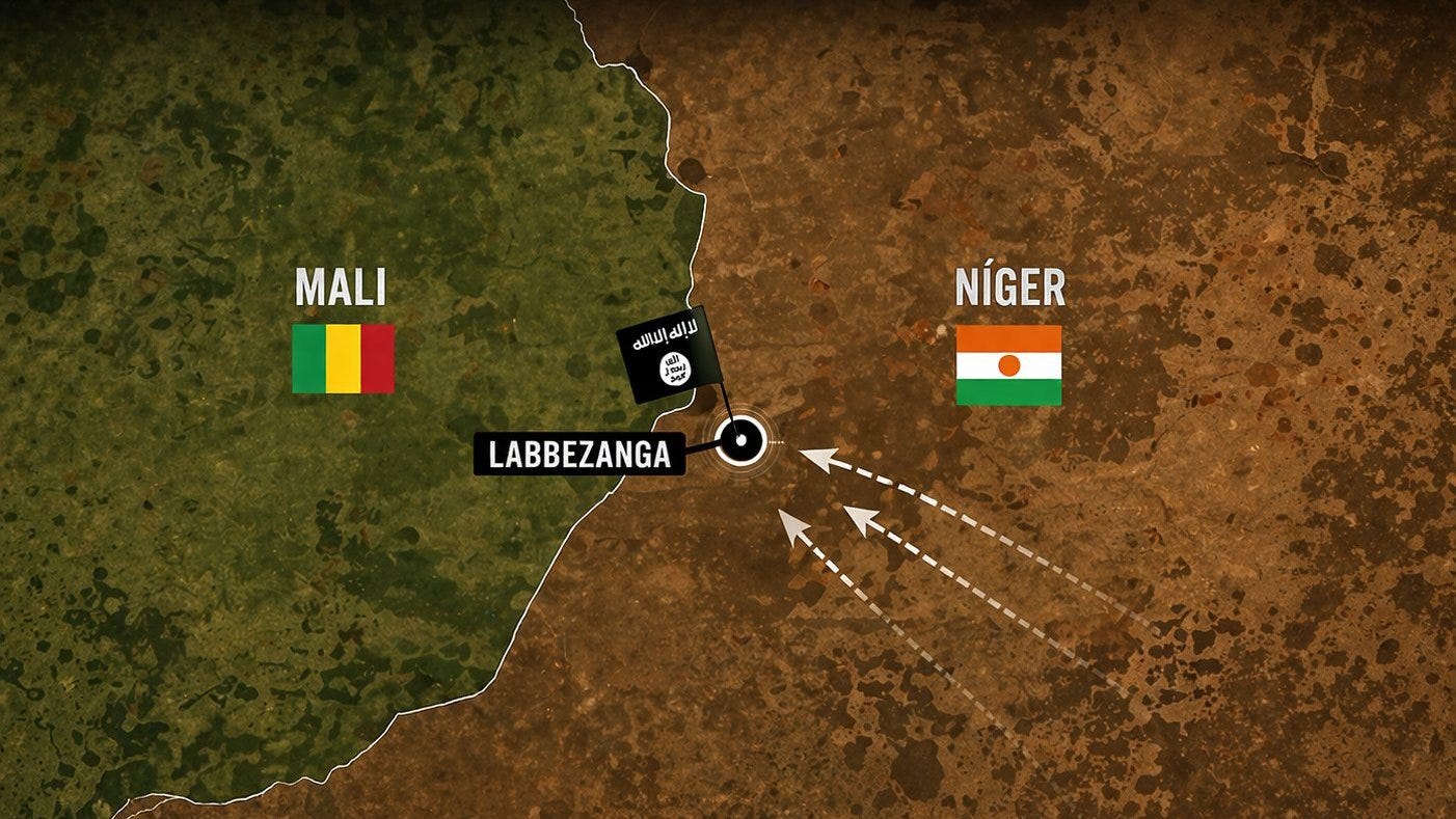
It’s not just simplified graphic maps that AI has been used to generate. I have had what appears at first to be an annotated satellite map. Below is an example of that. It’s also quite zoomed in, and the orientation is unclear, so trying to spot an inaccuracy in the border shape becomes more difficult.
This one was quite quick to spot, though, because even though only one town has been marked, it’s been marked on the wrong side of the border.
While some of the maps do look quite high quality and professional at first glance, it’s important to be aware that AI maps exist, and some ways that you can spot them.
As AI continues to get better, these tells will change and become more subtle and spotting AI-generated maps will no doubt become more challenging. At least for now, hopefully, when one comes up on your feed, you’ll be able to spot it before unintentionally sharing and boosting unreliable information.
If AI so clever, why maps wrong?